Fifty shades of grey...
Grey is my favourite colour. Erm, after pink of course...?! Why I love grey? Because it's chic, understated, warm, but also neutral, versatile and very adaptable - it has no undertone so it really can go with any colour of the spectrum.
When I retrained with KLC School of Design to become an interior stylist - more on my journey here - one of the most fascinating parts of the course for me was the psychology of colour and its power. Colour plays a central role in how we feel about our environment and about ourselves and each colour has a meaning behind it. I have always used bold colours in my interiors but until I did the course, I chose pieces and colours schemes based on my gut feeling. I would just mix colours because I just thought the final result would look good, not realising there is a whole symbolism behind my choices...
Grey symbolises everything that's quiet, calm, and understated. In personality tests people who prefer grey are said to want to insulate themselves from the outside world. I am the total opposite: loud, agitated and bold... So I usually choose grey as a backdrop for my interiors madness. And what's the best way to do that? By painting walls grey, of course! If you had a little snoop around my East London pad - check out the Chez Moi section - you'll have noticed that there is A LOT of grey walls in here! I took the plunge a few years ago, and since then, I've basically repainted almost every room of the house in grey. I use the term 'I' losely here as I am totally useless DIYer so obviously used the services of a skilled painter! What I found is that having a darker but neutral colour on the walls simply dresses a room and create the perfect backdrop for colours, accessories, art pieces, shelves to pop out, in a way that can never be the same with white walls.
I often get asked what type of grey I used in my own house, and I wish I could just name one that I used throughout the house but it's literally 'Fifty Shades of Grey' central in here. So here is a breakdown of what types of paint I have used and where.
Master bedroom
For our bedroom, I used Dulux Night Jewel 4. It's similar in shade to the one I used in our living area (see below) but with a very subtle hint of blue. It works well with the teal headboard and I like how the neon pink from the art pieces stands out.

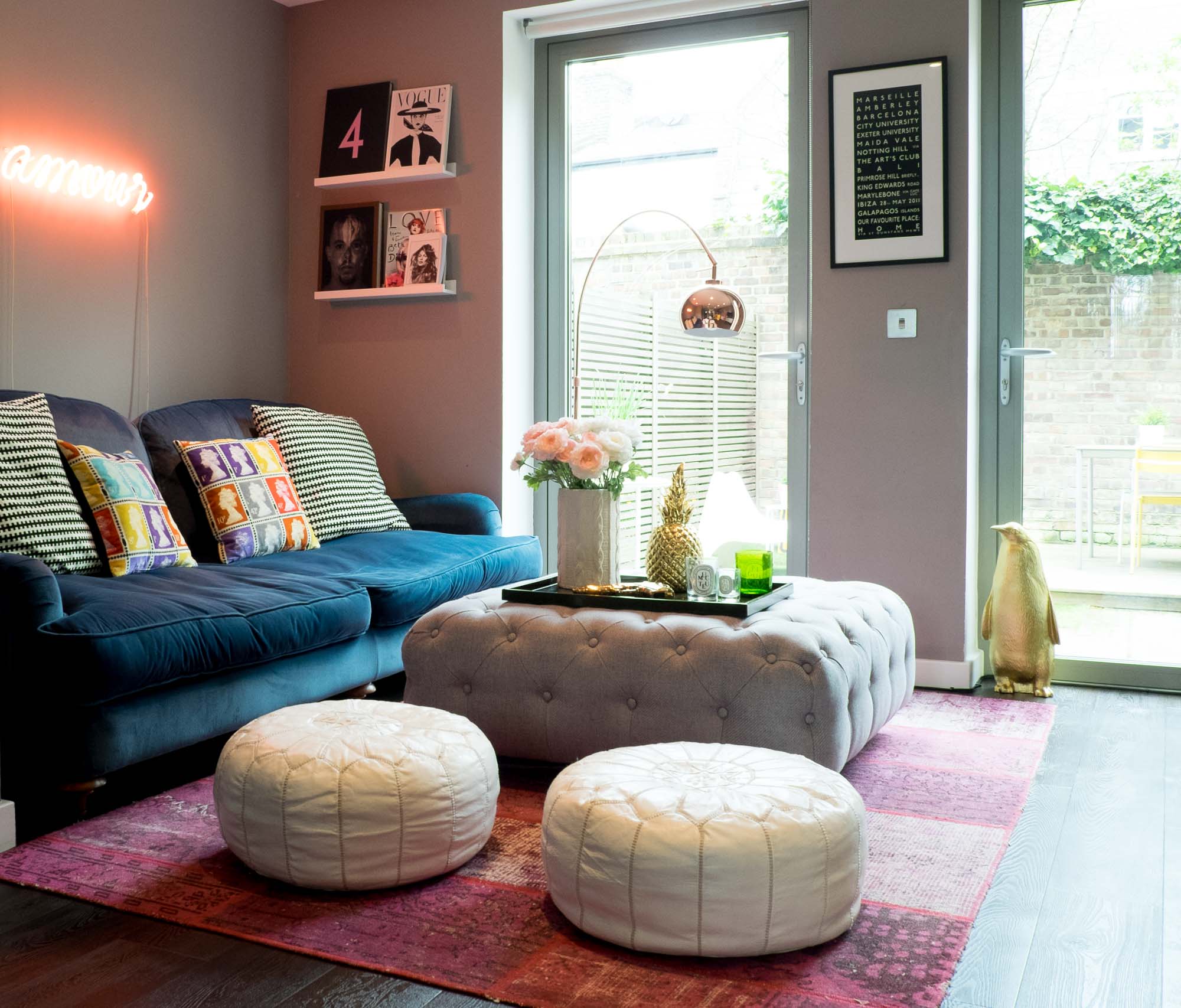
Living room
I recently posted a full 'before and after' feature about my living room refurb. Click here if you missed it. This was the first room we repainted after moving in (EVERYTHING was white). I used Potters Wheel by Dulux. It's a great shade - not too dark, not too light - a good one to pick if you are thinking of going dark but haven't got the confidence yet.
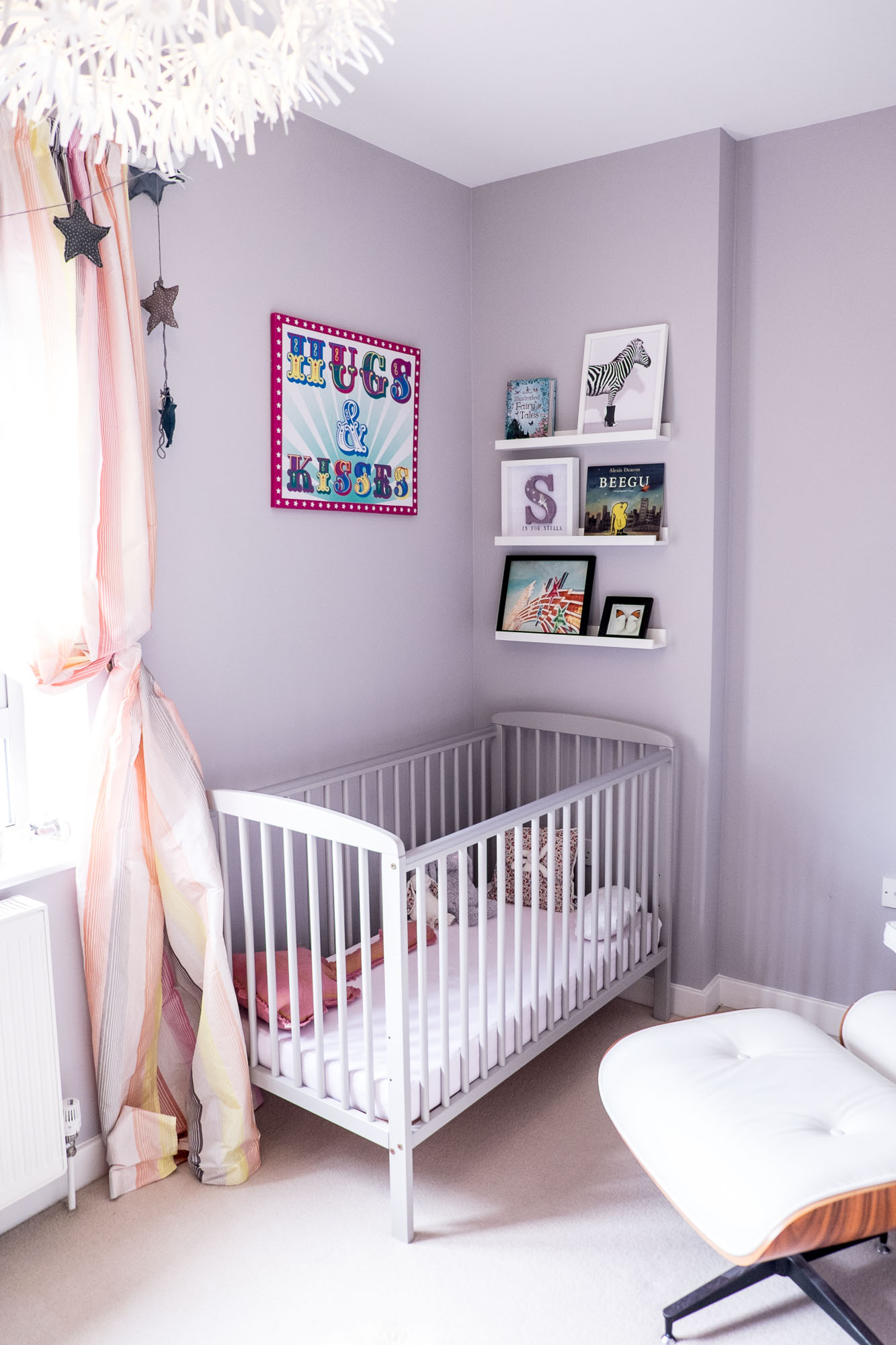
Stella's nursery
I was more cautious for Stella's bedroom because 1. I was a hormonal mess and changing my mind every two minutes about any type of decision, and 2. I thought dark walls in a girl's bedroom could be too much. So I opted for a slightly lighter shade with a hint of lilac. It's Dulux Potter's Clay 2. I also used it in the staircase. It gives a neutral theme to the room and makes all her pop colour accessories stand out.
Home office
I have a little corner of my home office that I use to get myself looking human in the morning with a dressing table and all the tools I need... In that room I went all out with Farrow & Bold Down Pipe. This was very scary as it looks almost black when you (I mean the professionals...) start painting and I really doubted myself when room was half way done. But once finished and with furniture, art and accessories in place, it just felt totally right and I am in love with this room. The problem is now the other shades of grey in the house are looking too light!

So that's it for Stella + the Stars' own Fifty Shades of Grey. What do you think? Are you considering using grey in your home decor?